The shape of the float (v0.3.1)
Did you know that CSS3 has a style called shape-outline? It’s pretty neat, it makes it so that a floated object gets a shape based on the alpha channel of its specified image. But it’s kind of a pain to set up; in plain HTML it looks something like this:
Did you know that CSS3 has a style called shape-outline? It’s pretty neat, it makes it so that a floated object gets a shape based on the alpha channel of its specified image. But it’s kind of a pain to set up; in plain HTML it looks something like this:
<img src="/path/to/image.png" width="320" height="320"
    style="shape-outline:url('/path/to/image.png');float: left">
and if you want a different shape mask for your image than its own alpha channel, you have to do a bunch of stuff like making sure that the image sizes are the same and whatever.
But in Publ there is now an additional attribute you can set on an image, shape, which is, I think, pretty easy to work with.
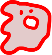
For example, the code for the little ghost in the intro is just:
and the code for this rawr right here is:
See, the rawr image is a .jpg file (which is why its box still overwrites the code blocks here, since there’s no transparency), and it’s pretty sparse, so I made a mask image for it, which looks like this:
On that note I also fixed a bug where you couldn’t add a background to a transparent paletted PNG (oops).
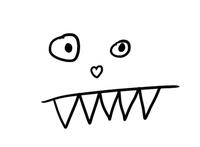
You can also mix-and-match shapes and masks, as I have done here where the not-smiley has the rawr mask and vice-versa. This can get really confusing, especially if the images are different sizes, but Publ attempts to make a best attempt to size them consistently with one another. You might just want to always have your mask image have the same aspect ratio as the base image, however, just to keep things a bit more sensible. Also I am mostly writing this extra-verbose text to have extra stuff to wrap around the images. While I’m here I’d might as well mention that mask images can come from any of the same sources as rendition images, but non-rendition images won’t be subject to the same sizing (as CSS3 does not provide any means of resizing the outline) so for example if you have your mask stored as a static image (i.e. @layout/thing-mask.png) it won’t be scaled along with the image as it’s being laid out. Although if the image being laid out is also a static image then it may or may not actually be sized at the same scale. I’m not sure; the spec is pretty vague about this and kind of handwaves about it. So really you only want to set shape masks on local/rendered images, and most of the time you’ll probably want to use the simple shape=True form since that’s the easiest to deal with.
And, note that the output shape will always be in the same format as the input image (i.e. a .png or a .gif or whatever), regardless of the ouput format set on the image tag; for example,  will still serve up a PNG of the image. If your PNG is big (and that’s why you’re telling it to render as a JPEG), your shape mask will also be pretty big. So, for shaped images it’s often a good idea to make a separate PNG8 for the shape mask anyway.
I have considered making the shape mask only write out a monochrome PNG that only preserves the shape in the alpha channel, but I wanted to keep support for one of the other CSS attributes, shape-image-threshold, which lets you specify the alpha threshold to use for the mask. Always flattening to a monochrome PNG wouldn’t allow for that. So, I opted to keep it simple for now, but this is certainly something to possibly revisit later. Perhaps as a compromise I’ll make it an RGBA PNG that is filled only with a solid color but preserves the original alpha channel.
Anyway! With all that said, you still need to set the stylesheet rules yourself. Well, you don’t need to; you can certainly do something like:
but for a nice responsive design you should instead do:
and then have a CSS rule like, for example:
.inset-left {
    float: left;
    shape-margin: 1ex;
    margin: 1ex;
}
and then you have the ability to override that rule with @media queries or whatever.
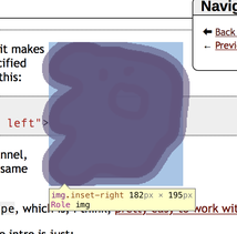
Anyway, if you want to diagnose the shape margins, most modern browsers' DOM/element/etc. inspectors will show you both the outline and its margin; for example, here’s Safari’s DOM inspector showing the outline of the ghost:
Anyway, the astute observer of the above might notice two new image format options, img_class and style. Previously there was only div_class which adds a style rule to the image set container, but img_class adds a CSS class to the individual <img> tags, and style adds a CSS rule to the image (but not to the div); img_style is also an alias for style. And, for the sake of symmetry I also added div_style even though it probably should never be used. If both style and img_style are specified, they will be combined together.
Note that the stacking behavior for these attributes can be a little counterintuitive. For an example of how this works:
img-1.png{img_style="inner img_style"} |
    img-2.png{style="inner style"}
    )
becomes (roughly):
<div class="foo">
<img src="img-1.png" style="inner img_style;top style">
<img src="img-2.png" style="top img_style;inner style">
</div>
which is to say, img_style and style both override individually and then at the end they combine together. I am sure there is something useful for someone in here, but honestly I don’t really care for the idea of people setting inline styles in the first place, so I’m not too concerned about how crappy the docs are at the moment.
Anyway, if you really want to use img_style and style my general guidance would be:
- Put
div_styleandimg_stylein the alt-text section (i.e. in the[]s) - Put
stylein on the individual images (i.e. the()s)
… and oh god I’m just realizing how terrible my docs are and how much I’d love to have an end-user of Publ to actually give doc feedback or maybe a proper technical writer to write the docs to make a lick of sense to someone who isn’t me. Sigh.
Anyway, tl;dr: Publ now makes it easy to tightly wrap text around floated images.
Oh, and I also fixed a regression in the PonyORM migration that made DRAFT and DELETED/GONE publish statuses not work right. Oops.


